Nanterre p10 - Dev Data
 semaine s14
semaine s15
semaine courante (s17)
planning des veilles
Seaborn
Seaborn is a Python data visualization library based on matplotlib. It provides a high-level interface for drawing attractive and informative statistical graphics.
For a brief introduction to the ideas behind the library, you can read the introductory notes. Visit the installation page to see how you can download the package and get started with it. You can browse the example gallery to see what you can do with seaborn, and then check out the tutorial and API reference to find out how. here
Useful Ressources:
http://matplotlib.org/
https://seaborn.pydata.org/examples/index.html
https://www.kaggle.com/learn/data-visualization
Grids
Grids are general types of plots that allow you to map plot types to rows and columns of a grid, this helps you create similar plots separated by features.
import seaborn as sns
import matplotlib.pyplot as plt
import pandas as pd
%matplotlib inline
iris = sns.load_dataset('iris')
iris.head()
| sepal_length | sepal_width | petal_length | petal_width | species | |
|---|---|---|---|---|---|
| 0 | 5.1 | 3.5 | 1.4 | 0.2 | setosa |
| 1 | 4.9 | 3.0 | 1.4 | 0.2 | setosa |
| 2 | 4.7 | 3.2 | 1.3 | 0.2 | setosa |
| 3 | 4.6 | 3.1 | 1.5 | 0.2 | setosa |
| 4 | 5.0 | 3.6 | 1.4 | 0.2 | setosa |
PairGrid
Pairgrid is a subplot grid for plotting pairwise relationships in a dataset.
# Just the Grid
sns.PairGrid(iris)
<seaborn.axisgrid.PairGrid at 0x1886fdb8ee0>
# Then you map to the grid
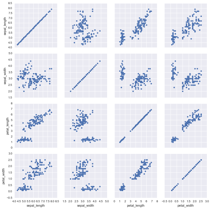
g = sns.PairGrid(iris)
g.map(plt.scatter)
<seaborn.axisgrid.PairGrid at 0x11f431208>
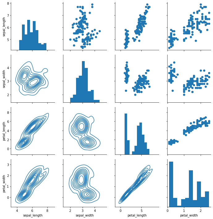
# Map to upper,lower, and diagonal
g = sns.PairGrid(iris)
g.map_diag(plt.hist)
g.map_upper(plt.scatter)
g.map_lower(sns.kdeplot)
<seaborn.axisgrid.PairGrid at 0x188732bcd30>
pairplot
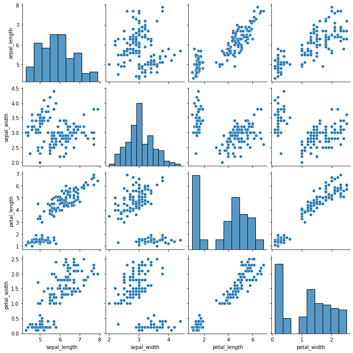
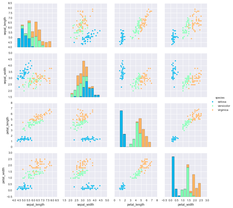
pairplot is a simpler version of PairGrid (you’ll use quite often)
sns.pairplot(iris)
<seaborn.axisgrid.PairGrid at 0x18873b7fd30>
sns.pairplot(iris,hue='species',palette='rainbow')
<seaborn.axisgrid.PairGrid at 0x12633f0f0>
Facet Grid
FacetGrid is the general way to create grids of plots based off of a feature:
tips = sns.load_dataset('tips')
tips.head()
| total_bill | tip | sex | smoker | day | time | size | |
|---|---|---|---|---|---|---|---|
| 0 | 16.99 | 1.01 | Female | No | Sun | Dinner | 2 |
| 1 | 10.34 | 1.66 | Male | No | Sun | Dinner | 3 |
| 2 | 21.01 | 3.50 | Male | No | Sun | Dinner | 3 |
| 3 | 23.68 | 3.31 | Male | No | Sun | Dinner | 2 |
| 4 | 24.59 | 3.61 | Female | No | Sun | Dinner | 4 |
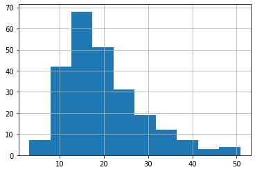
tips['total_bill'].hist()
<AxesSubplot:>
# Just the Grid
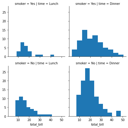
g = sns.FacetGrid(tips, col="time", row="smoker")
g = sns.FacetGrid(tips, col="time",  row="smoker")
g = g.map(plt.hist, "total_bill")
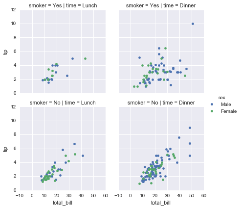
g = sns.FacetGrid(tips, col="time",  row="smoker",hue='sex')
# Notice hwo the arguments come after plt.scatter call
g = g.map(plt.scatter, "total_bill", "tip").add_legend()
JointGrid
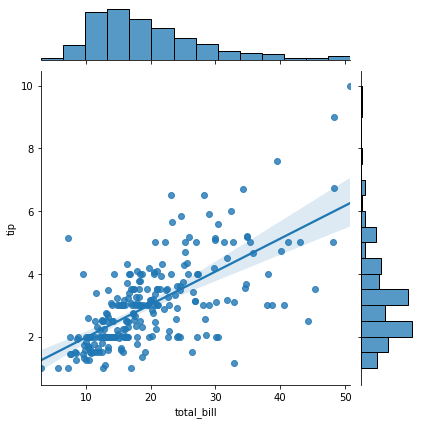
JointGrid is the general version for jointplot() type grids, for a quick example:
g = sns.JointGrid(x="total_bill", y="tip", data=tips)
g = g.plot(sns.regplot, sns.histplot)
Reference the documentation as necessary for grid types! here
Distribution Plots
plots , we can use, to visualize the distribution of a data set. These plots are:
- histplot()
- kdeplot()
- rugplot()
They are grouped together within the figure-level
- displot()
- jointplot()
- pairplot()
Imports
import seaborn as sns
%matplotlib inline
Data Seaborn comes withsome built-in data sets!
tips = sns.load_dataset('tips')
tips.head()
| total_bill | tip | sex | smoker | day | time | size | |
|---|---|---|---|---|---|---|---|
| 0 | 16.99 | 1.01 | Female | No | Sun | Dinner | 2 |
| 1 | 10.34 | 1.66 | Male | No | Sun | Dinner | 3 |
| 2 | 21.01 | 3.50 | Male | No | Sun | Dinner | 3 |
| 3 | 23.68 | 3.31 | Male | No | Sun | Dinner | 2 |
| 4 | 24.59 | 3.61 | Female | No | Sun | Dinner | 4 |
displot
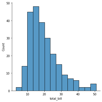
The displot shows the distribution of a univariate set of observations.
sns.displot(tips['total_bill'])
<seaborn.axisgrid.FacetGrid at 0x189271c5970>
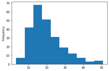
tips['total_bill'].plot.hist()
<AxesSubplot:ylabel='Frequency'>
pd.DataFrame.plot.hist?
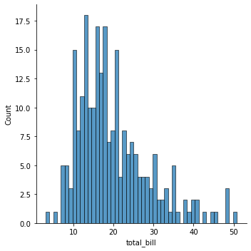
To remove the kde layer and just have the histogram use:
sns.displot(tips['total_bill'],kde=False,bins=50)
<seaborn.axisgrid.FacetGrid at 0x1892343c9d0>
jointplot
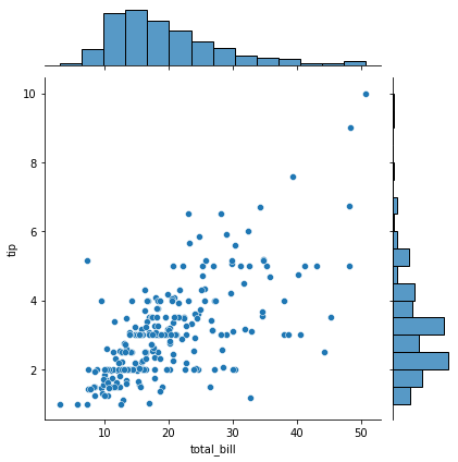
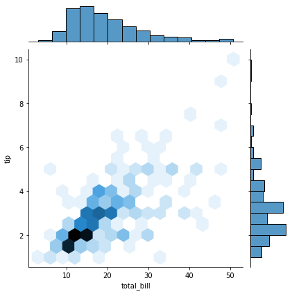
jointplot() allows you to basically match up two distplots for bivariate data. With your choice of what kind parameter to compare with:
- “scatter”
- “reg”
- “resid”
- “kde”
- “hex”
sns.jointplot(x='total_bill',y='tip',data=tips,kind='scatter')
<seaborn.axisgrid.JointGrid at 0x18927511ee0>
sns.jointplot(x='total_bill',y='tip',data=tips,kind='hex')
<seaborn.axisgrid.JointGrid at 0x1892877c520>
pairplot
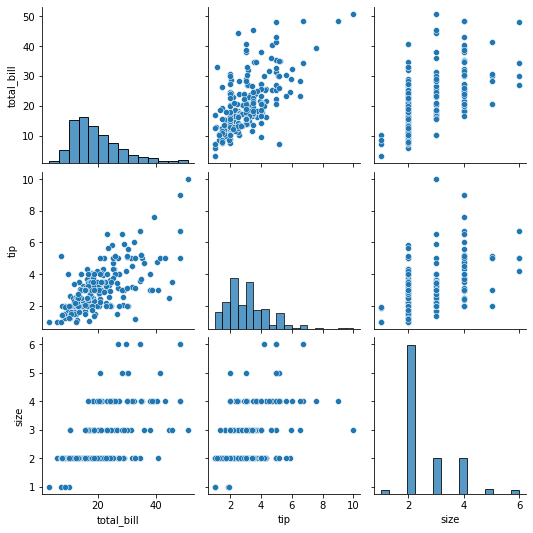
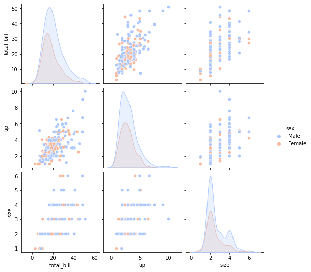
pairplot will plot pairwise relationships across an entire dataframe (for the numerical columns) and supports a color hue argument (for categorical columns).
sns.pairplot(tips)
<seaborn.axisgrid.PairGrid at 0x189288387f0>
sns.pairplot(tips,hue='sex',palette='coolwarm')
<seaborn.axisgrid.PairGrid at 0x18923448a90>
rugplot
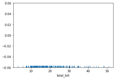
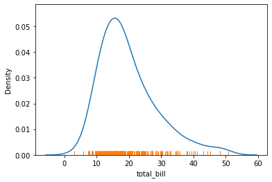
rugplots are actually a very simple concept, they just draw a dash mark for every point on a univariate distribution. They are the building block of a KDE plot:
sns.rugplot(tips['total_bill'])
<AxesSubplot:xlabel='total_bill'>
kdeplot
import matplotlib.pyplot as plt
import seaborn as sns
So with our tips dataset:
tips = sns.load_dataset('tips')
tips.head()
| total_bill | tip | sex | smoker | day | time | size | |
|---|---|---|---|---|---|---|---|
| 0 | 16.99 | 1.01 | Female | No | Sun | Dinner | 2 |
| 1 | 10.34 | 1.66 | Male | No | Sun | Dinner | 3 |
| 2 | 21.01 | 3.50 | Male | No | Sun | Dinner | 3 |
| 3 | 23.68 | 3.31 | Male | No | Sun | Dinner | 2 |
| 4 | 24.59 | 3.61 | Female | No | Sun | Dinner | 4 |
sns.kdeplot(tips['total_bill'])
sns.rugplot(tips['total_bill'])
<AxesSubplot:xlabel='total_bill', ylabel='Density'>
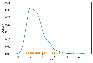
sns.kdeplot(tips['tip'])
sns.rugplot(tips['tip'])
<AxesSubplot:xlabel='tip', ylabel='Density'>
Categorical Data Plots
Now let’s discuss using seaborn to plot categorical data! There are a few main plot types for this:
- factorplot
- boxplot
- violinplot
- stripplot
- swarmplot
- barplot
- countplot
Let’s go through examples of each!
import seaborn as sns
%matplotlib inline
tips = sns.load_dataset('tips')
tips.head()
| total_bill | tip | sex | smoker | day | time | size | |
|---|---|---|---|---|---|---|---|
| 0 | 16.99 | 1.01 | Female | No | Sun | Dinner | 2 |
| 1 | 10.34 | 1.66 | Male | No | Sun | Dinner | 3 |
| 2 | 21.01 | 3.50 | Male | No | Sun | Dinner | 3 |
| 3 | 23.68 | 3.31 | Male | No | Sun | Dinner | 2 |
| 4 | 24.59 | 3.61 | Female | No | Sun | Dinner | 4 |
barplot and countplot
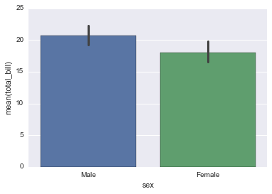
These very similar plots allow you to get aggregate data off a categorical feature in your data. barplot is a general plot that allows you to aggregate the categorical data based off some function, by default the mean:
sns.barplot(x='sex',y='total_bill',data=tips)
<matplotlib.axes._subplots.AxesSubplot at 0x11c99b8d0>
import numpy as np
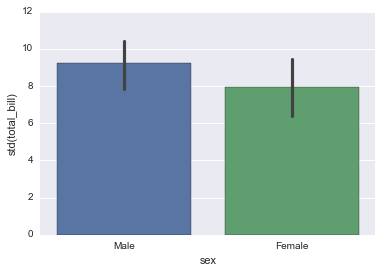
You can change the estimator object to your own function, that converts a vector to a scalar:
sns.barplot(x='sex',y='total_bill',data=tips,estimator=np.std)
<matplotlib.axes._subplots.AxesSubplot at 0x11c9b00b8>
countplot
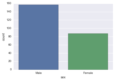
This is essentially the same as barplot except the estimator is explicitly counting the number of occurrences. Which is why we only pass the x value:
sns.countplot(x='sex',data=tips)
<matplotlib.axes._subplots.AxesSubplot at 0x1153276d8>
boxplot and violinplot
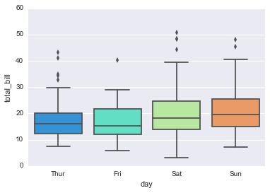
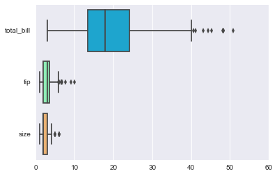
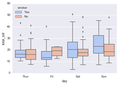
boxplots and violinplots are used to shown the distribution of categorical data. A box plot (or box-and-whisker plot) shows the distribution of quantitative data in a way that facilitates comparisons between variables or across levels of a categorical variable. The box shows the quartiles of the dataset while the whiskers extend to show the rest of the distribution, except for points that are determined to be “outliers” using a method that is a function of the inter-quartile range.
sns.boxplot(x="day", y="total_bill", data=tips,palette='rainbow')
<matplotlib.axes._subplots.AxesSubplot at 0x11db81630>
# Can do entire dataframe with orient='h'
sns.boxplot(data=tips,palette='rainbow',orient='h')
<matplotlib.axes._subplots.AxesSubplot at 0x11e2c0b00>
sns.boxplot(x="day", y="total_bill", hue="smoker",data=tips, palette="coolwarm")
<matplotlib.axes._subplots.AxesSubplot at 0x11e2c77f0>
violinplot
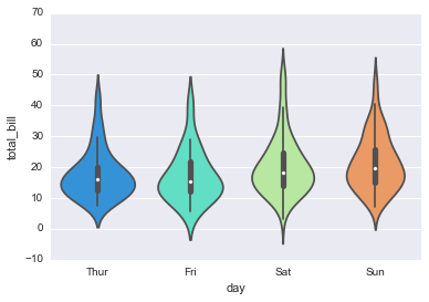
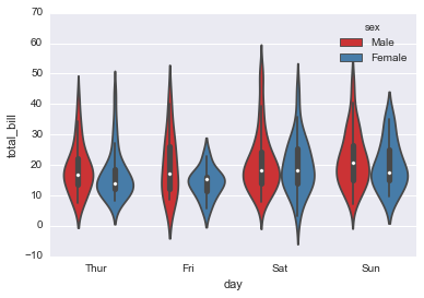
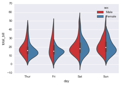
A violin plot plays a similar role as a box and whisker plot. It shows the distribution of quantitative data across several levels of one (or more) categorical variables such that those distributions can be compared. Unlike a box plot, in which all of the plot components correspond to actual datapoints, the violin plot features a kernel density estimation of the underlying distribution.
sns.violinplot(x="day", y="total_bill", data=tips,palette='rainbow')
<matplotlib.axes._subplots.AxesSubplot at 0x11e682ba8>
sns.violinplot(x="day", y="total_bill", data=tips,hue='sex',palette='Set1')
<matplotlib.axes._subplots.AxesSubplot at 0x11f739dd8>
sns.violinplot(x="day", y="total_bill", data=tips,hue='sex',split=True,palette='Set1')
<matplotlib.axes._subplots.AxesSubplot at 0x11f4d0710>
stripplot and swarmplot
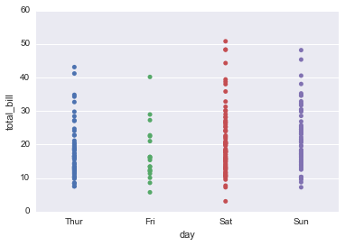
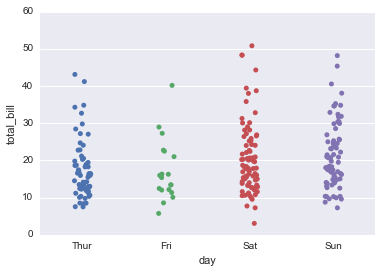
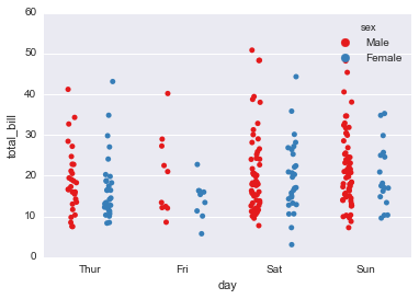
The stripplot will draw a scatterplot where one variable is categorical. A strip plot can be drawn on its own, but it is also a good complement to a box or violin plot in cases where you want to show all observations along with some representation of the underlying distribution.
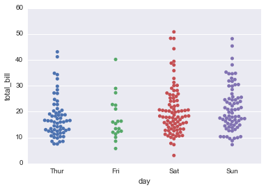
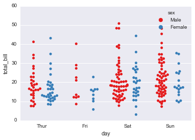
The swarmplot is similar to stripplot(), but the points are adjusted (only along the categorical axis) so that they don’t overlap. This gives a better representation of the distribution of values, although it does not scale as well to large numbers of observations (both in terms of the ability to show all the points and in terms of the computation needed to arrange them).
sns.stripplot(x="day", y="total_bill", data=tips)
<matplotlib.axes._subplots.AxesSubplot at 0x120272278>
sns.stripplot(x="day", y="total_bill", data=tips,jitter=True)
<matplotlib.axes._subplots.AxesSubplot at 0x1203a8470>
sns.stripplot(x="day", y="total_bill", data=tips,jitter=True,hue='sex',palette='Set1')
<matplotlib.axes._subplots.AxesSubplot at 0x12092e518>
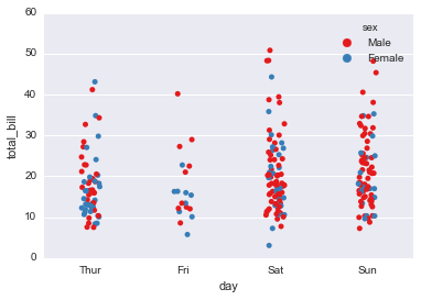
sns.stripplot(x="day", y="total_bill", data=tips,jitter=True,hue='sex',palette='Set1',split=True)
<matplotlib.axes._subplots.AxesSubplot at 0x12099db70>
sns.swarmplot(x="day", y="total_bill", data=tips)
<matplotlib.axes._subplots.AxesSubplot at 0x120c463c8>
sns.swarmplot(x="day", y="total_bill",hue='sex',data=tips, palette="Set1", split=True)
<matplotlib.axes._subplots.AxesSubplot at 0x1211b6da0>
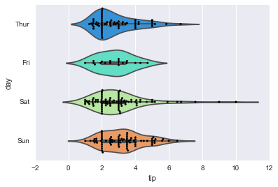
Combining Categorical Plots
sns.violinplot(x="tip", y="day", data=tips,palette='rainbow')
sns.swarmplot(x="tip", y="day", data=tips,color='black',size=3)
<matplotlib.axes._subplots.AxesSubplot at 0x1228af668>
factorplot
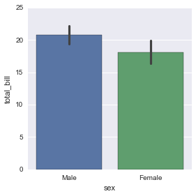
factorplot is the most general form of a categorical plot. It can take in a kind parameter to adjust the plot type:
sns.factorplot(x='sex',y='total_bill',data=tips,kind='bar')
<seaborn.axisgrid.FacetGrid at 0x11d03a278>
Matrix Plots
Matrix plots allow you to plot data as color-encoded matrices and can also be used to indicate clusters within the data (later in the machine learning section we will learn how to formally cluster data).
Let’s begin by exploring seaborn’s heatmap and clutermap:
import seaborn as sns
%matplotlib inline
flights = sns.load_dataset('flights')
tips = sns.load_dataset('tips')
tips.head()
| total_bill | tip | sex | smoker | day | time | size | |
|---|---|---|---|---|---|---|---|
| 0 | 16.99 | 1.01 | Female | No | Sun | Dinner | 2 |
| 1 | 10.34 | 1.66 | Male | No | Sun | Dinner | 3 |
| 2 | 21.01 | 3.50 | Male | No | Sun | Dinner | 3 |
| 3 | 23.68 | 3.31 | Male | No | Sun | Dinner | 2 |
| 4 | 24.59 | 3.61 | Female | No | Sun | Dinner | 4 |
flights.head()
| year | month | passengers | |
|---|---|---|---|
| 0 | 1949 | January | 112 |
| 1 | 1949 | February | 118 |
| 2 | 1949 | March | 132 |
| 3 | 1949 | April | 129 |
| 4 | 1949 | May | 121 |
Heatmap
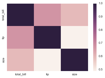
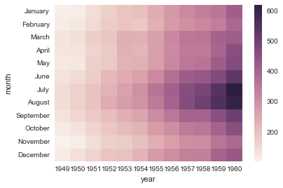
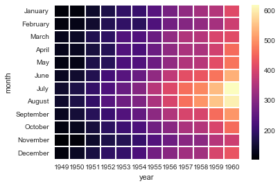
In order for a heatmap to work properly, your data should already be in a matrix form, the sns.heatmap function basically just colors it in for you. For example:
tips.head()
| total_bill | tip | sex | smoker | day | time | size | |
|---|---|---|---|---|---|---|---|
| 0 | 16.99 | 1.01 | Female | No | Sun | Dinner | 2 |
| 1 | 10.34 | 1.66 | Male | No | Sun | Dinner | 3 |
| 2 | 21.01 | 3.50 | Male | No | Sun | Dinner | 3 |
| 3 | 23.68 | 3.31 | Male | No | Sun | Dinner | 2 |
| 4 | 24.59 | 3.61 | Female | No | Sun | Dinner | 4 |
# Matrix form for correlation data
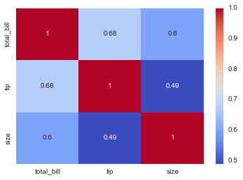
tips.corr()
| total_bill | tip | size | |
|---|---|---|---|
| total_bill | 1.000000 | 0.675734 | 0.598315 |
| tip | 0.675734 | 1.000000 | 0.489299 |
| size | 0.598315 | 0.489299 | 1.000000 |
sns.heatmap(tips.corr())
<matplotlib.axes._subplots.AxesSubplot at 0x11c31d470>
sns.heatmap(tips.corr(),cmap='coolwarm',annot=True)
<matplotlib.axes._subplots.AxesSubplot at 0x11c97a978>
Or for the flights data:
flights.pivot_table(values='passengers',index='month',columns='year')
| year | 1949 | 1950 | 1951 | 1952 | 1953 | 1954 | 1955 | 1956 | 1957 | 1958 | 1959 | 1960 |
|---|---|---|---|---|---|---|---|---|---|---|---|---|
| month | ||||||||||||
| January | 112 | 115 | 145 | 171 | 196 | 204 | 242 | 284 | 315 | 340 | 360 | 417 |
| February | 118 | 126 | 150 | 180 | 196 | 188 | 233 | 277 | 301 | 318 | 342 | 391 |
| March | 132 | 141 | 178 | 193 | 236 | 235 | 267 | 317 | 356 | 362 | 406 | 419 |
| April | 129 | 135 | 163 | 181 | 235 | 227 | 269 | 313 | 348 | 348 | 396 | 461 |
| May | 121 | 125 | 172 | 183 | 229 | 234 | 270 | 318 | 355 | 363 | 420 | 472 |
| June | 135 | 149 | 178 | 218 | 243 | 264 | 315 | 374 | 422 | 435 | 472 | 535 |
| July | 148 | 170 | 199 | 230 | 264 | 302 | 364 | 413 | 465 | 491 | 548 | 622 |
| August | 148 | 170 | 199 | 242 | 272 | 293 | 347 | 405 | 467 | 505 | 559 | 606 |
| September | 136 | 158 | 184 | 209 | 237 | 259 | 312 | 355 | 404 | 404 | 463 | 508 |
| October | 119 | 133 | 162 | 191 | 211 | 229 | 274 | 306 | 347 | 359 | 407 | 461 |
| November | 104 | 114 | 146 | 172 | 180 | 203 | 237 | 271 | 305 | 310 | 362 | 390 |
| December | 118 | 140 | 166 | 194 | 201 | 229 | 278 | 306 | 336 | 337 | 405 | 432 |
pvflights = flights.pivot_table(values='passengers',index='month',columns='year')
sns.heatmap(pvflights)
<matplotlib.axes._subplots.AxesSubplot at 0x11cd09320>
sns.heatmap(pvflights,cmap='magma',linecolor='white',linewidths=1)
<matplotlib.axes._subplots.AxesSubplot at 0x11d852780>
clustermap
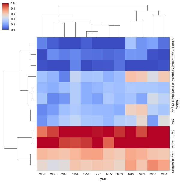
The clustermap uses hierarchal clustering to produce a clustered version of the heatmap. For example:
sns.clustermap(pvflights)
<seaborn.matrix.ClusterGrid at 0x11dbdf4a8>
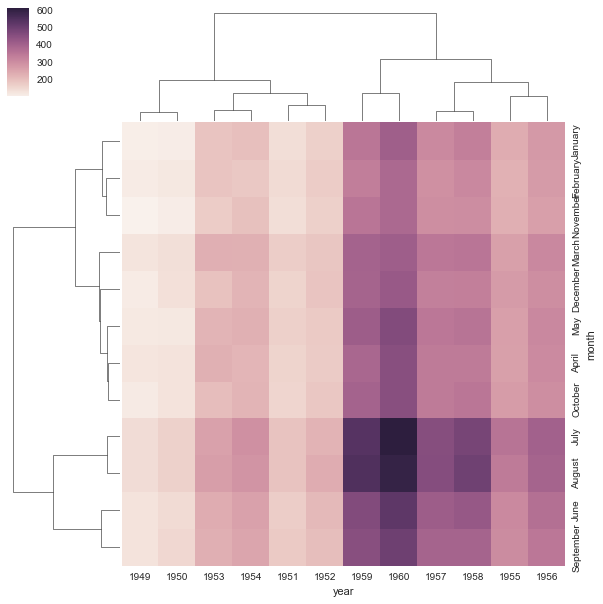
Notice now how the years and months are no longer in order, instead they are grouped by similarity in value (passenger count). That means we can begin to infer things from this plot, such as August and July being similar (makes sense, since they are both summer travel months)
# More options to get the information a little clearer like normalization
sns.clustermap(pvflights,cmap='coolwarm',standard_scale=1)
<seaborn.matrix.ClusterGrid at 0x11ef9d390>
